Add a Visual to a Single Tool Company Report
Objective
To add a visual to a single tool report.
Things to Consider
- Required User Permissions:
- To add a visual to a single tool company report that you created:
- 'Standard' level permissions or higher on the company's 360 Reporting tool.
AND - One of the following permissions for the tool being used as the data source:
- If you are creating a report for the Directory tool, 'Admin' level permission on the Directory tool.
- If you are creating a report for a Core, Project Management, or Quality & Safety tool, 'Read Only' level permission or higher on the tool being used as the data source.
- If you are creating a report for a Financial Management tool, 'Standard' level permission or higher on the tool being used as the data source.
- 'Standard' level permissions or higher on the company's 360 Reporting tool.
- To add a visual to a cloned single tool company report:
- Access to the cloned copy as its creator. See Clone a Company Single Tool Report.
Note: If a visual was added to the original report before you cloned the report, your cloned copy will include the original visual. You can remove the original visual from your cloned copy of the report and add your own visual.
- Access to the cloned copy as its creator. See Clone a Company Single Tool Report.
- To add a visual to a single tool company report that you created:
- Additional Information:
- The Add Visual button is only visible and available when the report's data set has fewer than 2500 records. See Why do I not see the Add Visual option on my report?
- If your report has multiple tabs, each tab can include a maximum of one (1) visual.
Steps
- Navigate to the Company 360 Reporting tool.
- In the Reports tab, locate the desired report.
- Click the report to open it.
- Click + Add Visual.
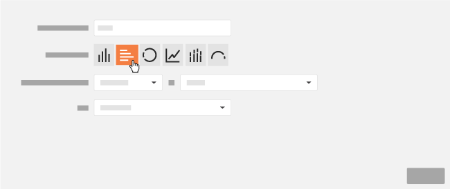
- Enter a name for your new visual in the Descriptive Title box.
- Next to Type of Visual, click the desired button to specify which visual to create.
Note: Depending on the visual, you will have the ability to select different measures on which the report's calculations can be made.
Type of Visual Description Purpose Measure If you select this option, do the following: 
Bar A bar graph is best used for visualizing trends and to represent changes over a period of time. COUNT, SUM, AVG, MIN, MAX - Select one of the supported measures from the Measure list.
- Select one of the available values from the Value list.
- Select the desired Category from the list.

Donut A donut (a.k.a., pie chart) is best used for showing relative proportion and to represent percentages. COUNT, SUM - Select one of the supported measures from the Measure list.
- Select one of the available values from the Value list.
- Select the desired Category from the list.

Line A line chart is best used for visualize trends by connecting data points over a period of time. COUNT, SUM, AVG, MIN, MAX - Select one of the supported measures from the Measure list.
- Select one of the available values from the Value list.
- Select the desired Category from the list.

Stacked Bar A stacked bar chart is best used for visualizing trends and to represent changes over time. It is helpful to use a bar chart when you require slightly more detail than a bar graph COUNT, SUM, AVG, MIN, MAX - Select one of the supported measures from the Measure list.
- Select one of the available values from the Value list.
- Select the desired Category from the list.
- Select the desired Second Category from the list.

Horizontal Bar A horizontal bar chart is best used for comparing data categories. COUNT, SUM, AVG, MIN, MAX - Select one of the supported measures from the Measure list.
- Select one of the available values from the Value list.
- Select the desired Category from the list.
- Select the desired Second Category from the list.

Gauge A gauge is best used for visualizing data that requires attention. It allows you to set a number or percentage threshold for your gauge. COUNT - Select one of the supported measures from the Measure list.
- Select one of the available values from the Value list.
- Select one of the available filters from the Filter list.
- Select the desired threshold value from the Turn Yellow if its Greater Than list.
- Select the desired threshold value from the Turn Red if its Greater Than list.
- Click the number or percentage button in the Show Thresholds As area.
- Click Save.
- Optional: If you want export your report with your new visual, click Export and select PDF with Visuals.